Evolution Timeline Infographics with AI: 4 Templates for Phones, Cars, Fashion & Human History
An evolution timeline turns 'how did X change over time' into one readable image. Phones from rotary to foldable. Cars from Model T to EVs. Fashion silhouettes by century. Human ancestors from Australopithecus to Sapiens. Done right it answers the question at a glance — done wrong it is a busy chart that demands reading. The difference comes down to four template shapes, each suited to a different time-span and subject density. This guide walks all four, with inline examples and the prompt recipes that produce them.
What makes an evolution timeline readable
An evolution timeline is a chronological infographic where each step is depicted, not just labeled. The reader sees the shape of change — the species that came before, the phone screen that got bigger, the kimono silhouette of that period — without parsing text.
Three design choices separate readable timelines from busy ones:
Layout direction: Horizontal suits long sweeps (millennia, geological eras, 30-year tech curves). Vertical suits dense recent history (last 10 years of social-app UIs). Pick layout from time-span density *before* picking visuals.
Step depiction style: A row of illustrated portraits reads faster than text-heavy cards. Each step needs to be visually distinct at thumbnail size — if your iPhone 4 and your iPhone 16 look the same at 200 pixels, the timeline failed.
Transition cue: The eye needs a hint about pace. Compressed periods (rapid evolution) use tight spacing or arrows; slow periods use whitespace. Most AI tools default to even spacing and lose this information — you have to specify it in the prompt.
Tools compared for evolution timelines
Generic image generators (Midjourney, DALL·E 3, Imagen 4, Nano Banana Pro freeform): One image per stop, then manual layout in Figma, Canva, or Affinity Designer. Higher per-stop quality and more flexible art direction; no automatic consistency. Use when the art direction matters more than the composition speed, or when you need a branching cladogram that no single-image template handles.
Notebook LM and Perplexity / Gemini research tools: Generate the chronology (the *what* and *when*) but not the visuals. Pair with a visual generator. The chronology is often where errors enter — verify dates against a primary source before committing them to the image, since image regeneration is cheaper than re-publishing with wrong dates.
Traditional infographic tools (Venngage, Piktochart, Canva): Pre-built timeline templates with text-heavy stops. Slow to produce; the visual quality ceiling is the asset library. Skip for AI-native workflows unless you need editable text post-production for client revisions.
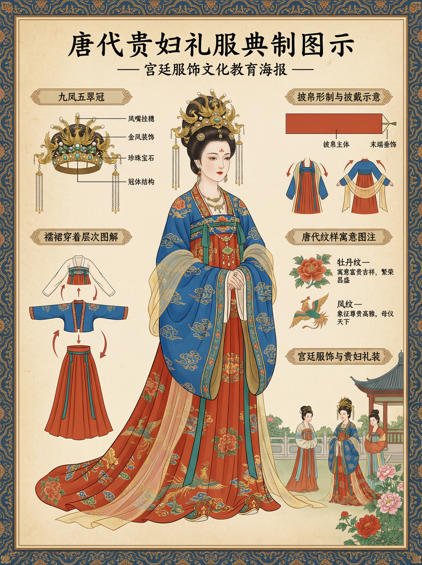
Where Curify fits
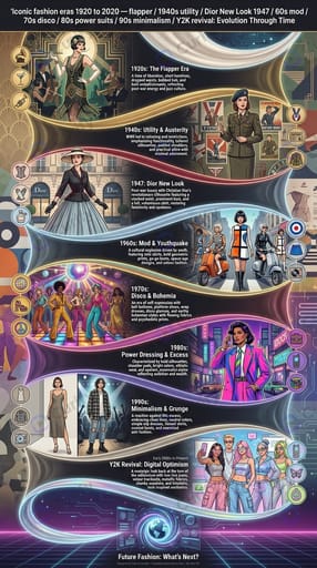
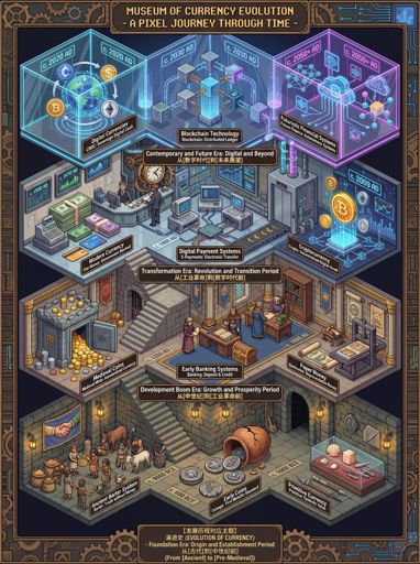
Skip the prompt-engineering and go directly to the templates with parameters pre-filled: **Isometric evolution scene** ([/nano-template/evolution](/nano-template/evolution)) — supply `theme`. Best for civilizational arcs (Industrial Revolution, Western Art, Chinese Social Changes, Currency Forms, Transportation, Human Evolution). The renderer produces an isometric pixel-art diorama in 3:4 vertical, dense with period detail per stage. **Vintage educational timeline poster** ([/nano-template/evolution-timeline-infographic](/nano-template/evolution-timeline-infographic)) — supply `topic`. Sepia-toned, hand-drawn, numbered stops. Use for phones, cars, cameras, bicycles, snacks, human evolution. For a richer historical variant with period-specific iconography, the deeper-detail [/nano-template/historical-evolution-timeline-infographic](/nano-template/historical-evolution-timeline-infographic) is the same shape with stronger period anchoring. **Regional clothing & fashion evolution poster** ([/nano-template/clothing-evolution-poster](/nano-template/clothing-evolution-poster)) — supply `region`. 18 live regional variants in the gallery covering Chinese, Japanese, Korean, Indian, Egyptian, French, British, German, Italian, Greek, Russian, Mexican, and Iranian — plus sneaker and denim decade variants. **Modern editorial history timeline** ([/nano-template/history-timeline-infographic](/nano-template/history-timeline-infographic)) — supply `timeline_topic`. 13 live examples spanning product histories (Apple, photography, video games, marketing agencies), cultural arcs (coffee, vintage fashion, fashion eras 1920-2020, film awards), and national-team histories (Brazil, Germany, Italy, Argentina at the FIFA World Cup). **Generation comparison infographic** ([/nano-template/generation-comparison-infographic](/nano-template/generation-comparison-infographic)) — supply `topic`. For comparison across periods rather than progression through periods — Gen X vs Gen Z lifestyle, 1990s vs 2020s consumer habits. Parallel-track layout rather than single-axis linear; different shape than the four core timeline templates, same subject family. For adjacent costume / portrait work — single-figure dynasty costumes via [/nano-template/costume](/nano-template/costume) (47 live examples) or flat-lay costume deconstruction via [/nano-template/ethnic-costume-deconstruction-board](/nano-template/ethnic-costume-deconstruction-board) — Curify ships those as separate single-subject templates rather than evolution-timeline shapes. For broader country-overview work, [/nano-template/national-culture-history-infographic](/nano-template/national-culture-history-infographic) ships a country-wide history + culture + visual identity poster that goes wider than evolution-timelines. The gallery covers 90+ rendered examples across these shapes. The same prompt works across the 10 platform locales — Spanish-language demand for *infografía de la evolución* is particularly strong, and the localized example gallery surfaces it natively at [/es/topics/evolution](/es/topics/evolution).
Pick the shape, then the subject
1. Pick the shape — isometric civilizational scene, vintage educational poster, regional fashion, or editorial product history. The shape is determined by the subject's *kind* (cultural arc vs product progression vs regional fashion vs editorial chronology), not by personal aesthetic preference. 2. Pick the time-span density — long sweep horizontal, dense recent vertical, S-curve editorial. Density determines layout. 3. Ground each stop in a specific real subject — name the species, model, dynasty, or milestone. Vague names generate fictional stops. 4. Verify the chronology before publishing — image regen is cheap; retraction is not.
For any of the four shapes, the Curify Nano Banana template is the fastest path to a publishable image. For branching trees and multi-track comparatives, render per-stop and compose outside. The visual is only as good as the chronology — verify dates first, then render.
Popular Template Examples
Explore our most popular Nano Banana prompt templates to see what's possible:
Take the next step
Putting what you read into practice.
Related Articles
Nano Templates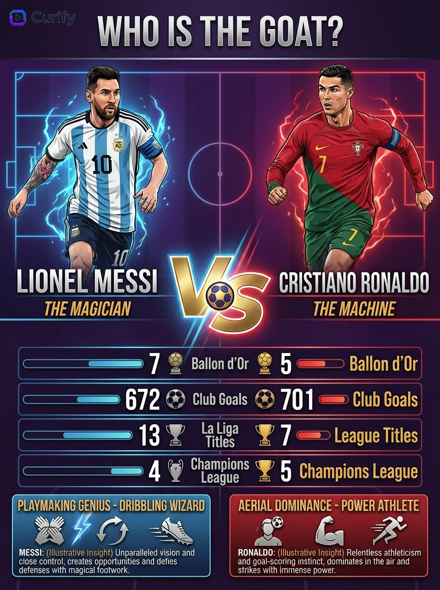
Brazil & Argentina 2026 World Cup Poster Prompts: Squad + Fans Tributes
Ultimate Directory of Nano Banana Prompts